
Table of Contents
In the dynamic world of React JS, alerts play an essential role in user interaction, offering instant feedback or vital information in various engaging ways. This updated 2024 guide delves into the fundamentals of integrating alerts into your React applications. From leveraging the straightforward JavaScript alert() function for quick notifications to crafting custom alert components for a seamless user experience, and exploring the visually appealing SweetAlert for rich modal dialogs, we cover it all.
Different types of Alert Usage in React Applications
Utilizing JavaScript alert() in React
The simplest way to display an alert in React is by using the JavaScript alert() function. This method is useful for quick notifications or debugging messages. Here’s how to use it within a React component:
function showAlert() {
  alert('This is an alert message!');
}
You can trigger this function on events like button clicks:
<button onClick={showAlert}>Show Alert</button>
Creating Custom Alert Components
For a more seamless user experience that matches your application’s styling, you can create custom alert components. Here’s a basic example:
Step 1: Define the Alert Component
Create a new component that will serve as your alert. This component can accept props to customize the message and the alert type (success, error, etc.).
// AlertComponent.js
const AlertComponent = ({ message, type }) => {
  return (
    <div className={`alert alert-${type}`}>
      {message}
    </div>
  );
};
Step 2: Style the Alert
Using CSS, define styles for each alert type. You can add transitions or animations for a smoother appearance and the disappearance of alerts.
.alert {
  padding: 15px;
  margin-bottom: 20px;
  border: 1px solid transparent;
  border-radius: 4px;
  opacity: 0;
  transition: opacity 0.5s linear;
}

.alert-success { background-color: #dff0d8; color: #3c763d; }
.alert-error { background-color: #f2dede; color: #a94442; }

/* Show the alert */
.alert-show {
  opacity: 1;
}
Step 3: Implement the Alert in Your Application
Now, integrate your AlertComponent where needed. You can manage its visibility with state, displaying the alert based on user actions or other application events.
import React, { useState } from 'react';
import AlertComponent from './AlertComponent';

const App = () => {
  const [alert, setAlert] = useState({ show: false, message: '', type: '' });

  const showAlert = (message, type) => {
    setAlert({ show: true, message, type });
    setTimeout(() => setAlert({ show: false, message: '', type: '' }), 3000);
  };

  return (
    <div>
      {alert.show && <AlertComponent message={alert.message} type={alert.type} />}
      <button onClick={() => showAlert('This is a success alert!', 'success')}>Show Success Alert</button>
      <button onClick={() => showAlert('This is an error alert!', 'error')}>Show Error Alert</button>
    </div>
  );
};
Adding Alerts with SweetAlert in React
SweetAlert is a versatile library that offers a more visually appealing alternative to the default browser alert, providing customizable, rich modal dialogs. Here’s how you can incorporate SweetAlert into your React application for dynamic alerts.
Step 1: Install SweetAlert
First, add SweetAlert to your project. Open your terminal in your project directory and run:
npm install sweetalert
Step 2: Import SweetAlert
In the component where you want to use SweetAlert, import it at the top of your file:
import swal from 'sweetalert';
Step 3: Triggering SweetAlert
You can trigger SweetAlert models in response to events, such as button clicks. Here’s an example of how to display a basic alert:
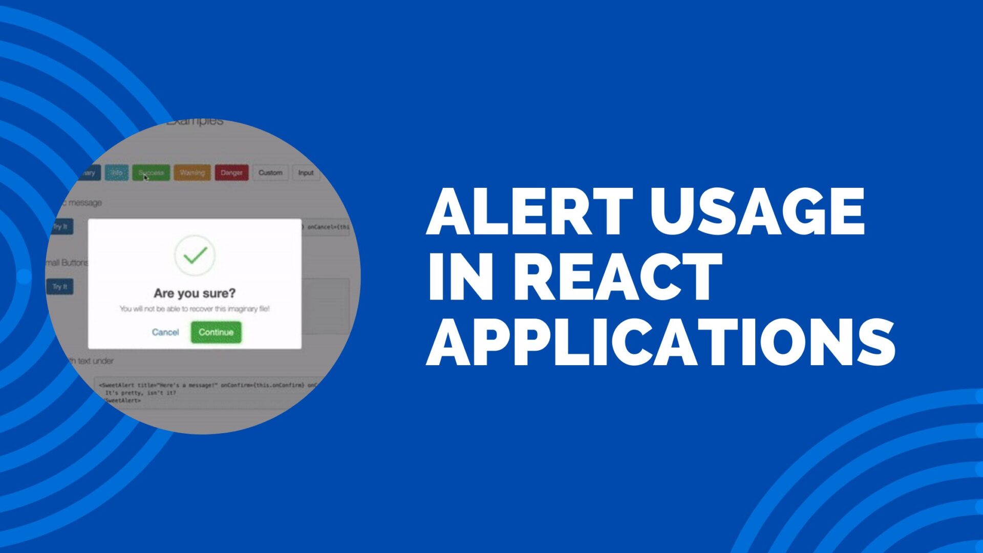
const showSweetAlert = () => {
  swal({
    title: "Are you sure?",
    text: "Once deleted, you will not be able to recover this imaginary file!",
    icon: "warning",
    buttons: true,
    dangerMode: true,
  })
  .then((willDelete) => {
    if (willDelete) {
      swal("Poof! Your imaginary file has been deleted!", {
        icon: "success",
      });
    } else {
      swal("Your imaginary file is safe!");
    }
  });
};
Step 4: Customize Your Alert
SweetAlert allows for extensive customization. Beyond the basic alert, you can set icons, and buttons, and even include forms within your alerts. Explore the SweetAlert documentation to discover all the customization options available.
Step 5: Implementing the Alert
Add a button or any other trigger in your component’s JSX to call your SweetAlert function:
<button onClick={showSweetAlert}>Delete File</button>
Conclusion
Alerts are an indispensable tool in React JS, vital for engaging user interaction. This guide offers a comprehensive overview, from basic implementations with the native alert() function to advanced customizations with SweetAlert, paving the way for a variety of alert uses in your applications. Explore these methods to enhance communication and interaction within your React projects, making alerts not just informative but an integral part of your user experience strategy.
Alert in React JS – FAQs
Install SweetAlert with npm install sweetalert, then use it in your component to display styled alerts by calling swal(“Title”, “Message”, “info”).
Capture the textbox value using state, and use alert(stateValue) in an event handler to display the textbox value.
Use the JavaScript alert() function within a component method or event handler to display a simple alert dialog.
For basic alerts, call alert(“Message”) within any event handler. For custom dialogs, use a state-controlled component that renders based on a condition.
Invoke the alert() function with a message string as its argument in response to events or component lifecycle stages to show a browser alert box.
